Project
![]() Redesign of a complete desktop icon system for Provenir — aligning legacy UI with modern branding and UX principles.
Redesign of a complete desktop icon system for Provenir — aligning legacy UI with modern branding and UX principles.
Role
I was brought in to redesign the entire iconography system used in Provenir’s desktop product. My role covered brand analysis, concept development, visual system design, and production of nearly 300 scalable and pixel-perfect icons. I worked closely with the client to define brand-adherent visual principles and transform those into a cohesive UI system.
Introduction
Provenir is a global leader in real-time risk decisioning platforms. They requested a full overhaul of their internal product icons — replacing outdated interface visuals with a modern, brand-aligned design system.
Background
The client’s core requirements were:
- Custom, brand-specific icon designs
- Modern flat-line aesthetics
- Functionally clear and relevant metaphors
- Visual consistency across the entire system
Approach
I began by analyzing the Provenir logo to identify brand characteristics that could inform the icon design language. Key findings included:
- Strategic use of intersecting shapes (used sparingly)
- Blend of sharp and rounded corners within the same object
- Layered line weights to differentiate primary and secondary shapes
Based on the brand palette, I selected the core Provenir blue for primary shapes, a soft blue for secondary accents, and neutral gray for balance.

Creative Process
To illustrate the design method, I’ll focus on one icon: the Adaptors icon. I started with a mood board to gather references and spark visual thinking.

From there, I sketched five concept directions:
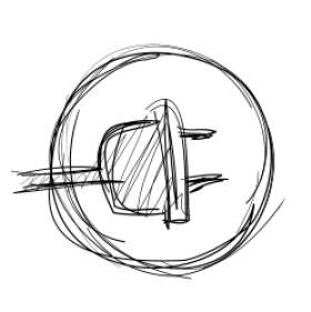
A generic connector shape that implies plug-in capability.

A stylized plug not tied to electrical metaphors.

Incorporating a database symbol to imply data connectivity.

Floating spheres representing varied data sources.

Multiple plug heads indicating adaptability.
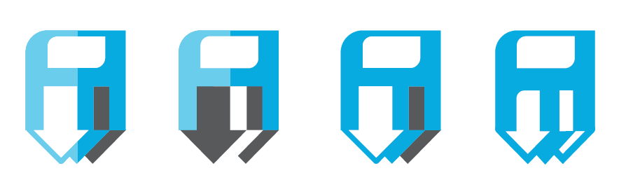
The client selected concept #4. I then rendered high-fidelity visuals. We further refined it by incorporating the letter “P” from Provenir’s logo as a connector, creating stronger brand resonance.


Development
Once the style and structure were approved, I scaled the system — designing multiple icons per category and refining for pixel perfection across 32×32, 26×26, and 24×24 grids.
Decision Engine

Release Management

Save All
Manage Settings Engine

All icons were output as SVG assets, supporting color flexibility while retaining vector quality. Final versions were optimized for multiple resolutions.
Result
The project resulted in a complete redesign of nearly 300 interface icons. The updated system gave Provenir a modern, brand-consistent, and scalable asset library. The icons continue to enhance usability and visual cohesion across their product suite.