Project
Complete brand identity system built around clarity, flexibility, and emotional resonance — including character design, visual language, and multi-platform integration.
Role
I led the development of Turtle’s brand identity — shaping its tone, visual direction, and emotional presence across web, product, content, and marketing. This included designing a mascot that embodies the brand values, establishing a cohesive illustration and animation style, and ensuring consistency across all brand touchpoints.
Brand Strategy
Turtle.dev is a platform that reimagines how developers work — emphasizing fairness, autonomy, and long-term collaboration. The brand identity needed to feel calm, trustworthy, and future-facing — while standing apart from the corporate stiffness often seen in the dev tools space.
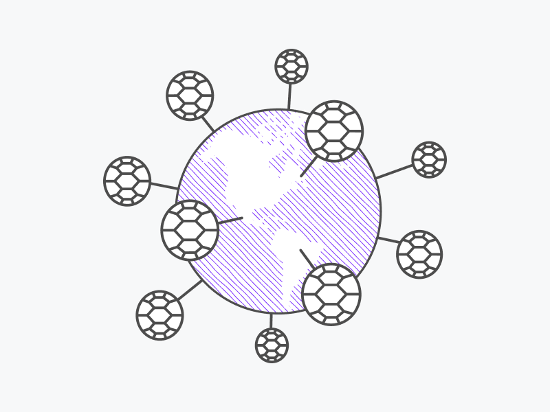
Visual Language
The brand system was built around softness, clarity, and approachability. Rounded shapes, spacious compositions, and a relaxed pastel palette defined the core style. This created a visual tone that contrasted with typical “enterprise tech” branding — aligning instead with values of transparency, human connection, and optimism.
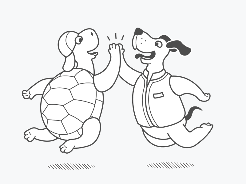
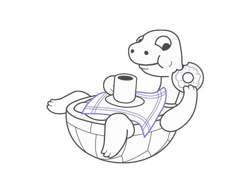
Character System
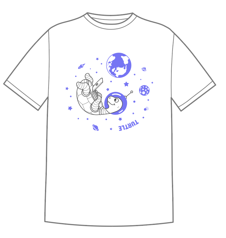
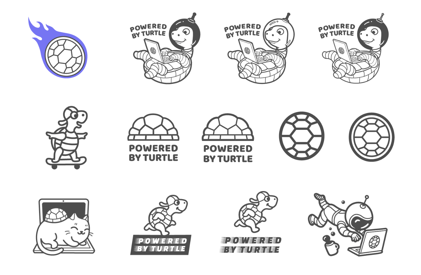
As the face of the brand, Cody The Turtle became the narrative carrier of Turtle’s personality — friendly, autonomous, and reliable. His design evolved from early sketches into a mascot deployed across product, marketing, and community channels.
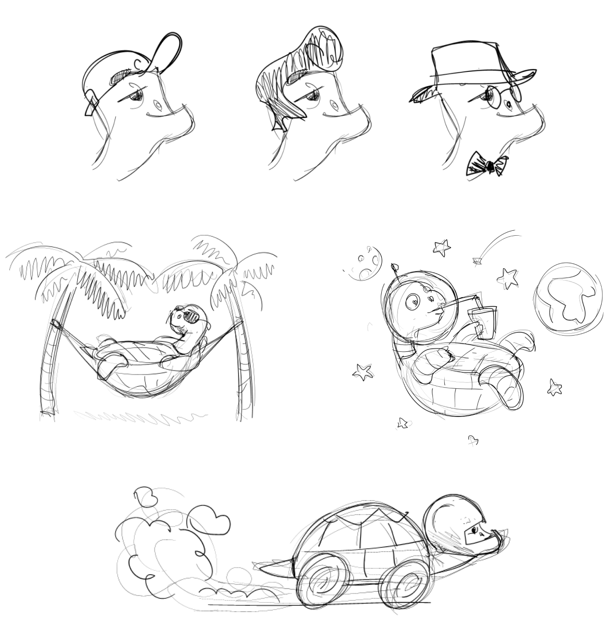
The space-themed environment reinforced the themes of remoteness and deep focus — both realities of modern development workflows. The name “Cody” was selected for its friendly tone and subtle tech reference.
System Implementation
The identity system was deployed across the full brand ecosystem — from website and dashboard UI to blog visuals, pitch decks, and physical swag. The visual elements were modular and easily extendable, enabling fast iteration while preserving brand consistency.
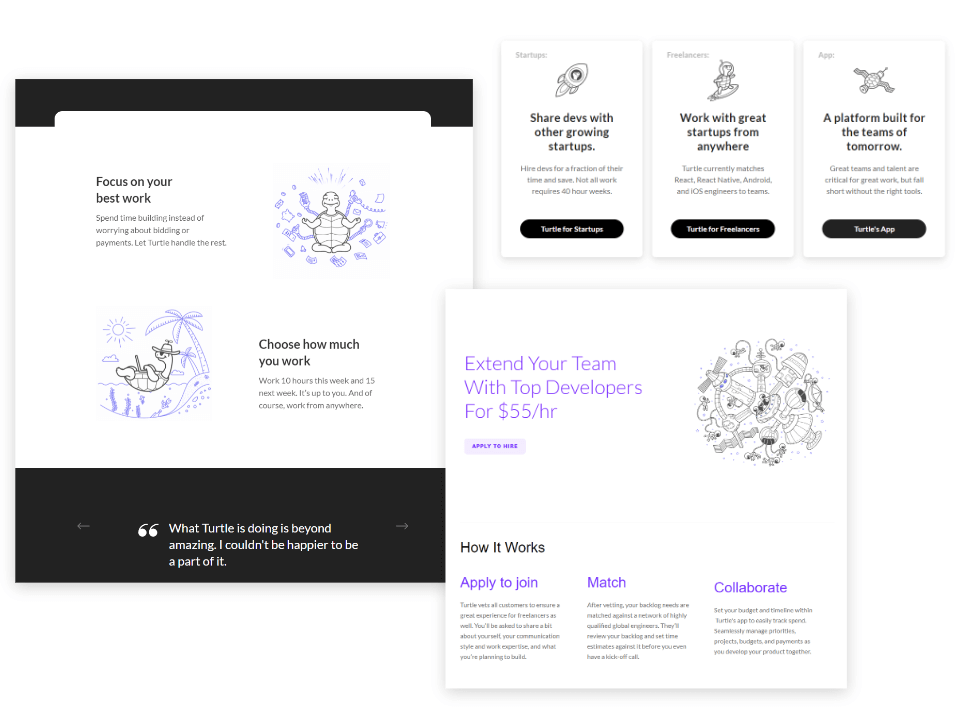
The use of illustrations and character cues across the site added warmth and coherence to the UX, while supporting the emotional narrative of the platform.
Content & Communication
Custom illustrations and visual metaphors were developed to explain complex concepts and product philosophy across the blog, onboarding, and internal presentations. These visuals provided continuity with the brand tone and helped position Turtle as thoughtful and user-centered.


Brand Collateral
The visual identity extended into physical goods, including T-shirts, laptop stickers, and event materials. These supported community growth and word-of-mouth by making the brand visible, relatable, and shareable.
Impact
- Clear Brand Differentiation: Stood out in a saturated space through personality-first identity.
- System Scalability: Modular visual language that worked across product, marketing, and community.
- User Engagement: Increased time on site, recall, and brand preference among the dev community.
- Emotional Connection: Made the platform feel human and trustworthy through consistent visual tone.
User Feedback
Feedback from users and community surveys confirmed that the identity — especially the presence of Cody — made the platform more memorable and emotionally engaging. Brand awareness and recognition significantly improved after launch.