Project
 Redesign of a complete desktop icon system for Provenir — aligning legacy UI with modern branding and UX principles.
My role
I redesigned the icon system for Provenir’s desktop product, from brand analysis and concept exploration to production of nearly 300 icons. I worked with the client to establish the visual rules and apply them across the library.
The brief
Provenir needed to replace its legacy interface icons with a coherent library that reflected its brand and the functions of its risk-decisioning product.
Requirements
The brief called for a flat-line style, clear functional metaphors and consistent execution across the entire set. The icons also needed to feel specific to Provenir.
Defining the rules
I used the logo as a starting point for the icon language: selective intersections, a combination of sharp and rounded corners, and different line weights for primary and secondary forms.

I extended that hierarchy into color, using Provenir blue for primary shapes, a softer blue for accents and neutral gray for balance.

Testing the direction
The Adaptors icon shows how the system developed. I gathered references, then explored different ways to represent connectivity before committing to a finished style.

I presented five concept directions for discussion:
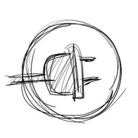
A generic connector shape that implies plug-in capability.

A stylized plug not tied to electrical metaphors.

Incorporating a database symbol to imply data connectivity.

Floating spheres representing varied data sources.

Multiple plug heads indicating adaptability.
The client selected the fourth direction. During refinement, we incorporated the “P” from Provenir’s logo as a connector, linking the functional metaphor more closely to the brand.


Scaling the system
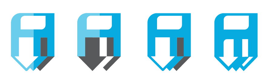
Once the direction was approved, I applied it across the library and refined the icons on 32×32, 26×26 and 24×24 grids. Each size required attention to detail and pixel alignment.
Decision Engine

Release Management

Save All
Manage Settings Engine

I delivered the icons as SVG assets, with versions optimized for the required sizes and support for color variation.

Delivered
Nearly 300 redesigned interface icons, supported by a consistent visual language and size-specific execution. The project connects brand interpretation, client collaboration and detailed production across a substantial UI library.