Project
Visual identity, icon system, UI animations, and onboarding experience for a financial collaboration app — Status.
Role
I collaborated with Status during its early-stage development to define the visual style of the app and build key interface elements. I worked closely with founders, developers, UX designers, and researchers to design the icon system, create animated feedback components, and build a multi-screen onboarding animation. My goal was to ensure a cohesive and engaging visual language across the entire app.
Challenge
Status was in a concept stage with early UX wireframes in place, but lacked a visual identity and UI elements. The project required defining the look and feel of the brand, designing a complete set of navigation and data icons, creating onboarding animations, and designing responsive feedback animations for various app operations.
Audience
- Non-gender specific
- Ages 25–55
- Basic to moderate financial knowledge
- Sociable and goal-oriented
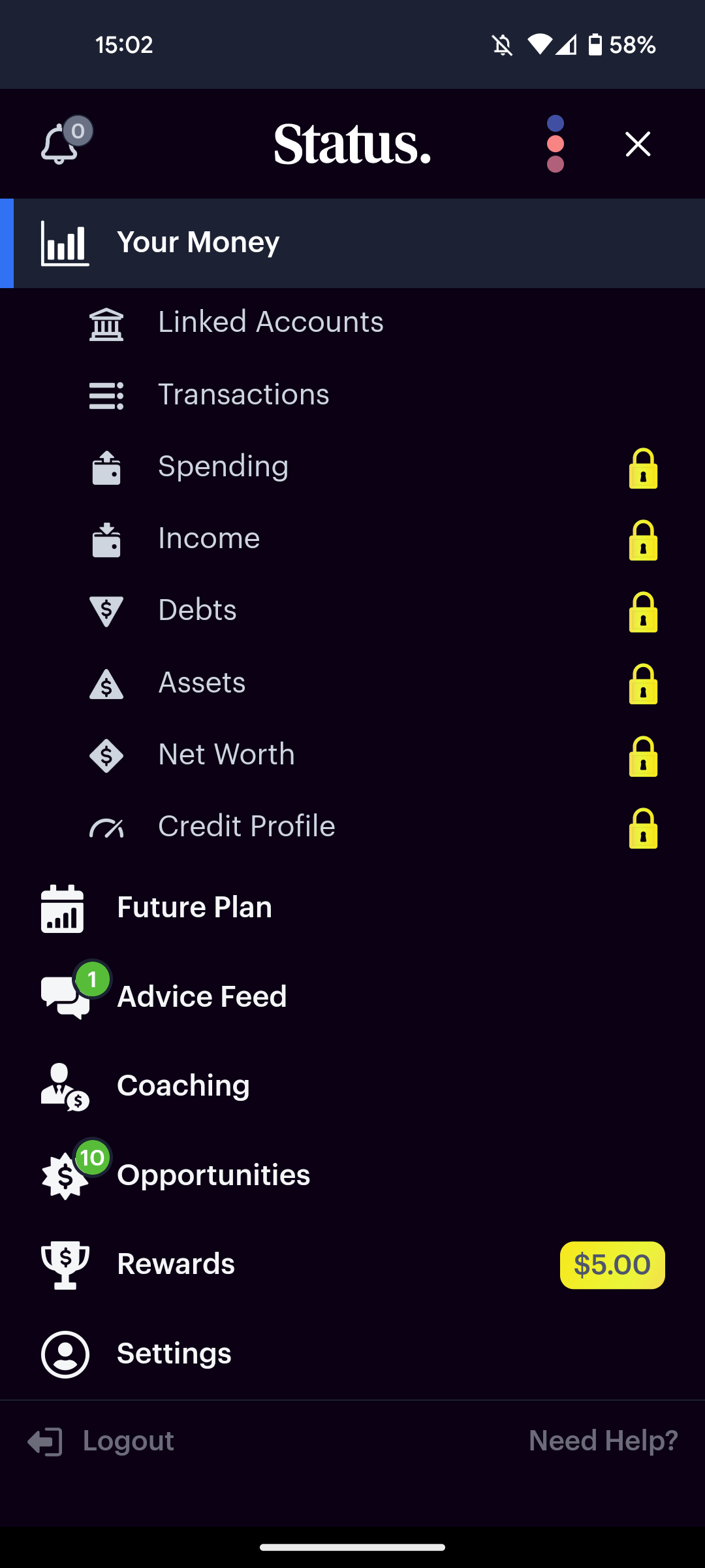
Icon System
The app required two distinct icon types, each with its own purpose and constraints:
Navigational Icons
- Optimized for dark backgrounds
- Clear, distinct shapes for instant recognition
- Bold enough to support active use
Informational Icons
- Background-agnostic
- Subtle and supportive — doesn’t distract from data
- Readable at varying sizes
I chose glyph-style icons for navigation and outline style for informational use. Concepts were reviewed and tested with focus groups for usability validation.
Animated UI Feedback
To make operations like loading, success, and errors more engaging and intuitive, I designed three animated indicators aligned with the app’s branding. These were built to scale across different screens and flow naturally within the interface.
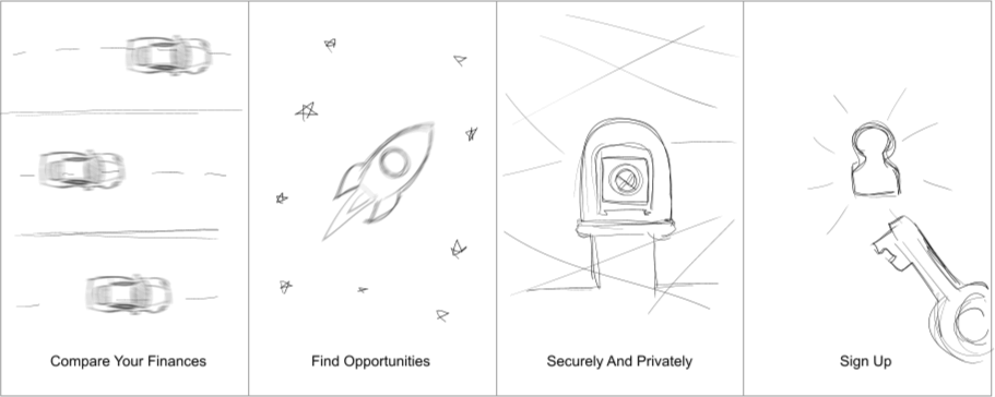
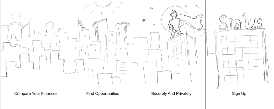
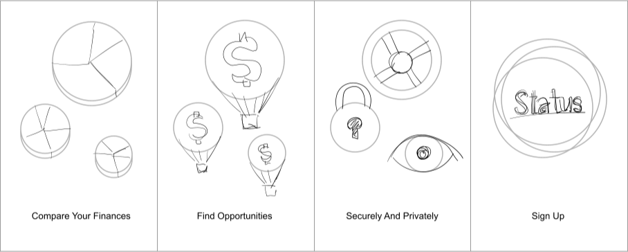
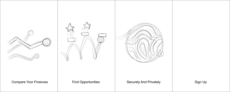
Intro Animation Sequence
I created a four-screen carousel onboarding animation to introduce first-time users to the app’s core features. The sequence had to be smooth, informative, and visually inviting — guiding users to the sign-up screen without interrupting flow.
- Compare Your Finances
- Find Opportunities
- Securely and Privately
- Sign Up
I explored several visual directions through sketching. The final concept, chosen by the client, incorporated a padlock to represent privacy and security — replacing the initial fingerprint idea.
Final Product
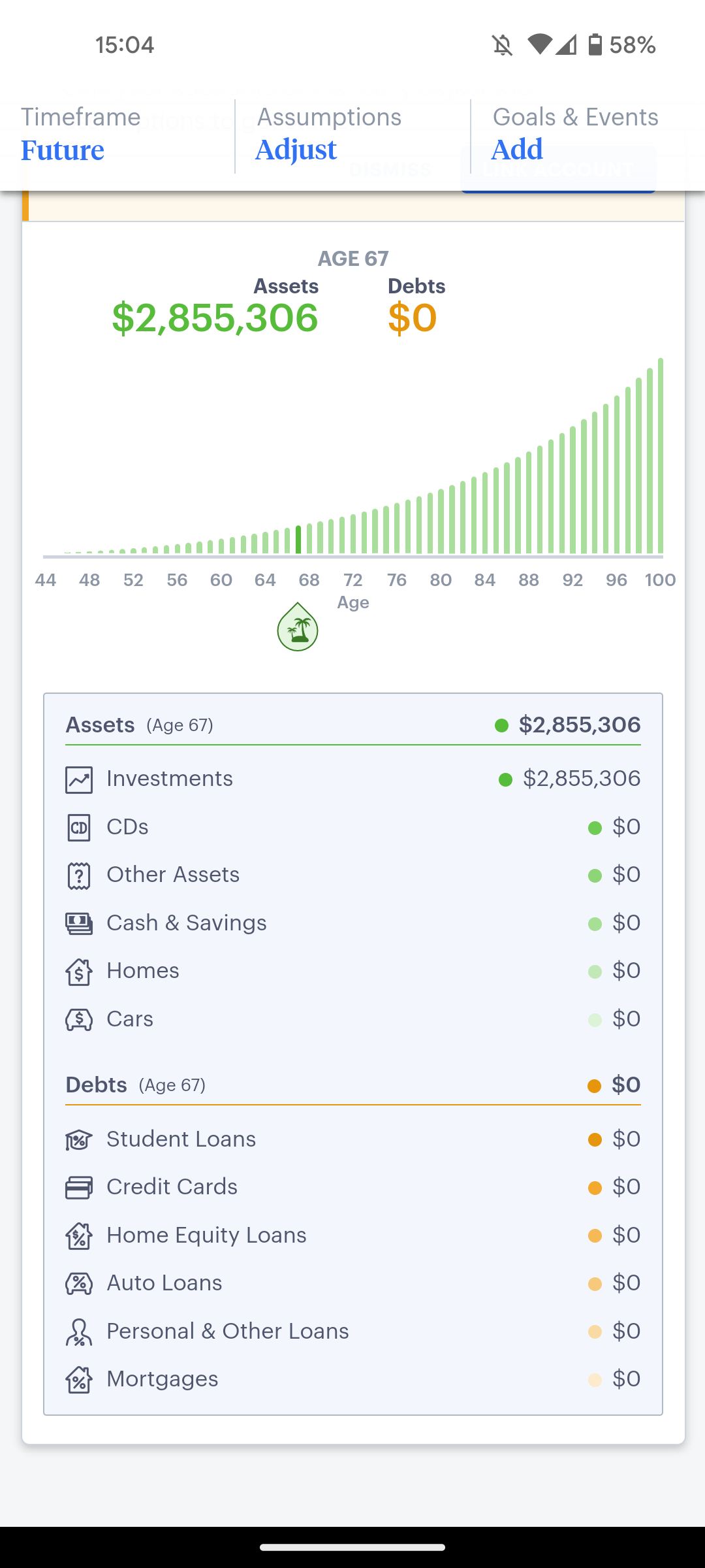
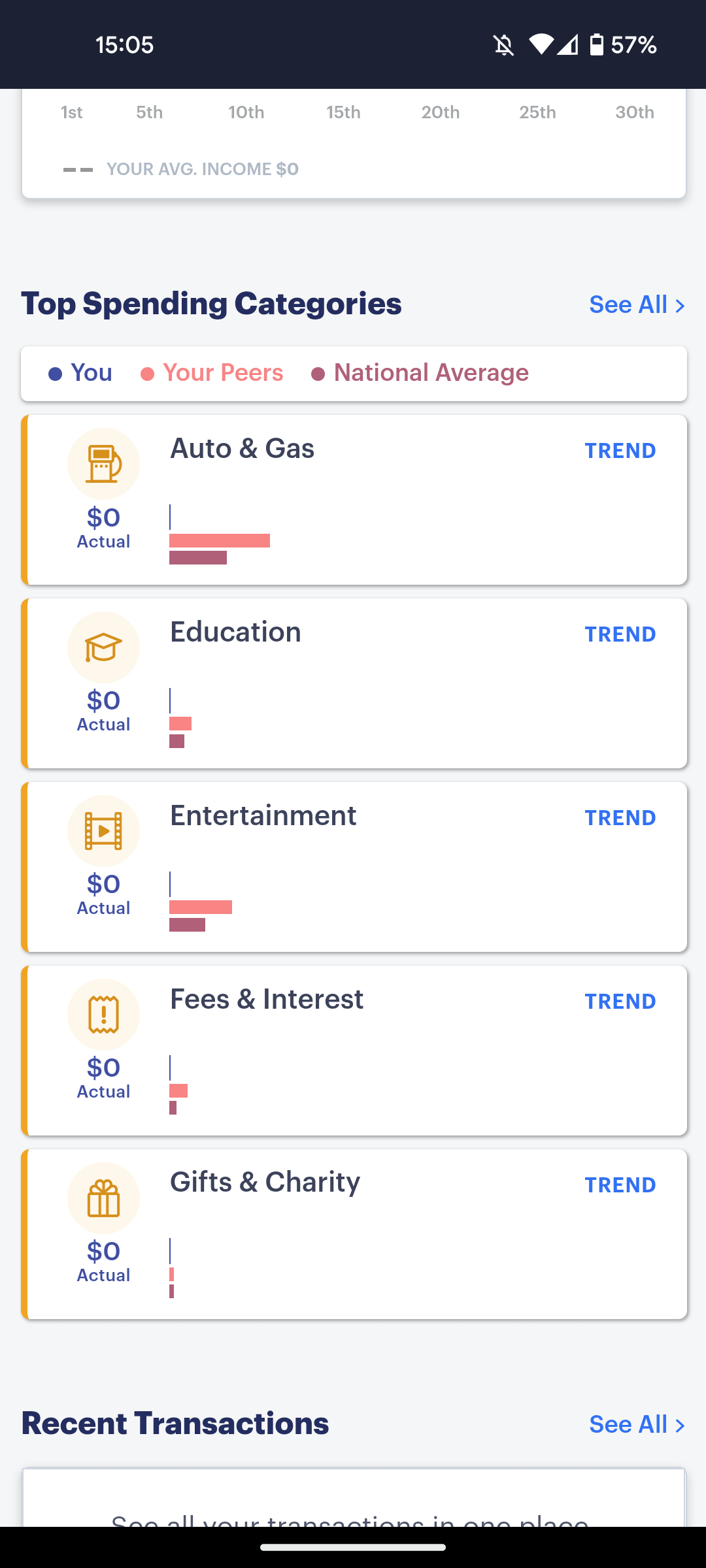
The Status app was successfully launched, and I’m proud to have contributed to its visual identity and user experience. My work helped shape the product’s tone, trustworthiness, and visual appeal — from onboarding to in-app feedback.