Brief
BNP Paribas requested a “colorful and happy” collection of icons and interface elements for web and mobile. The central design task was carrying that detailed visual style into very small interface sizes.
My approach
I developed a glossy, realistic treatment suited to the brief and refined its execution across the required sizes.
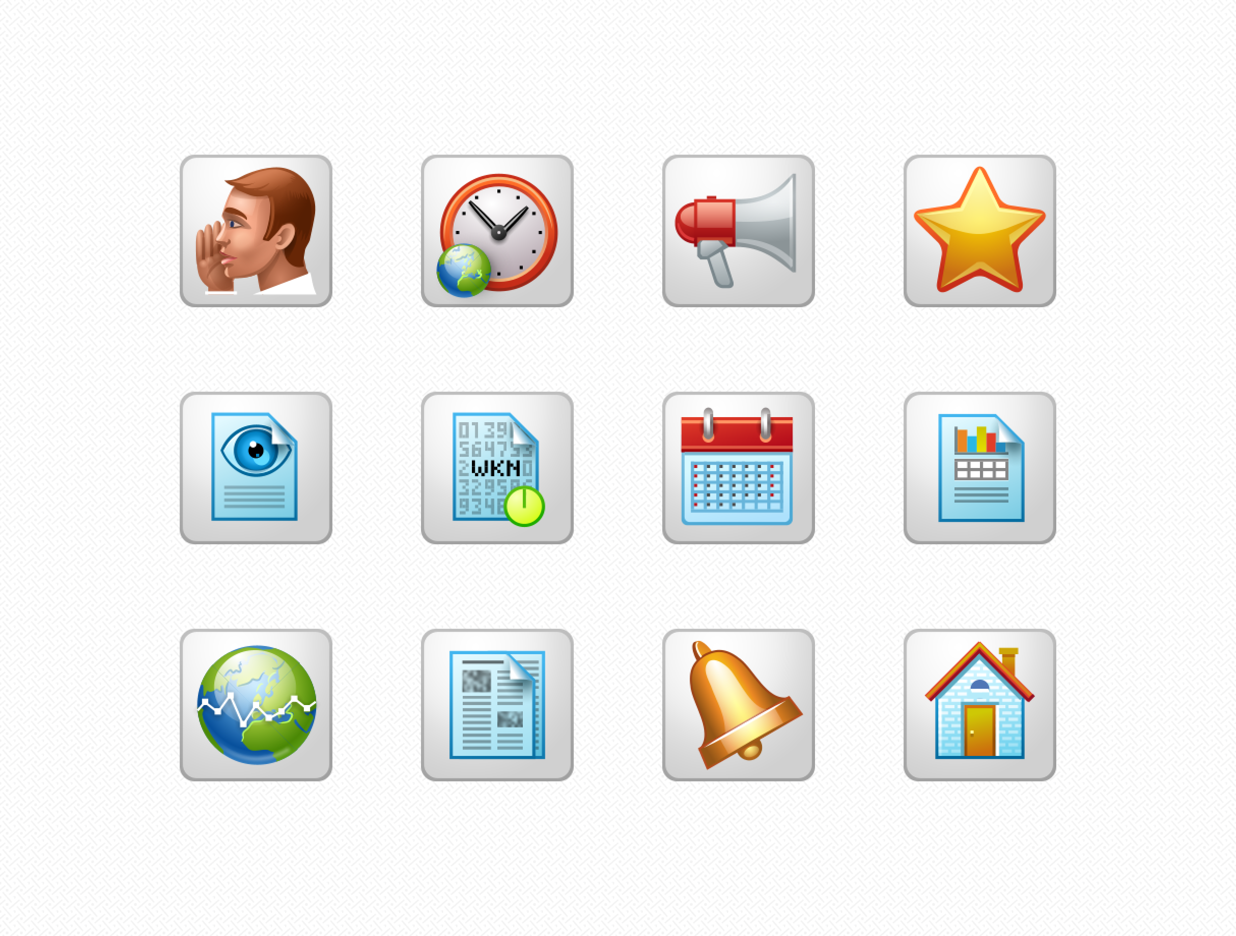
- Style: I adopted a realistic and glossy skeuomorphic style, which was highly popular at the time. The use of bright colors and intricate detailing ensured the icons were both visually striking and aligned with the bank’s desired aesthetic.
- Sizes: To accommodate the varying requirements of digital interfaces, I designed icons in small sizes such as 32×32, 24×24, and 16×16 pixels. Each icon was manually adjusted for pixel-perfect clarity and visual consistency across all sizes.










Delivered
A coordinated collection of icons and interface elements, including manually adjusted 32×32, 24×24 and 16×16 versions. The project demonstrates detailed production work under tight size constraints.
