Challenge
BNP Paribas bank aimed to enhance their digital platforms, including their website and mobile applications, with visually appealing and user-friendly icons and interface elements. The client requested a “colorful and happy” aesthetic that aligned with their brand messaging while maintaining practicality across various sizes and styles.
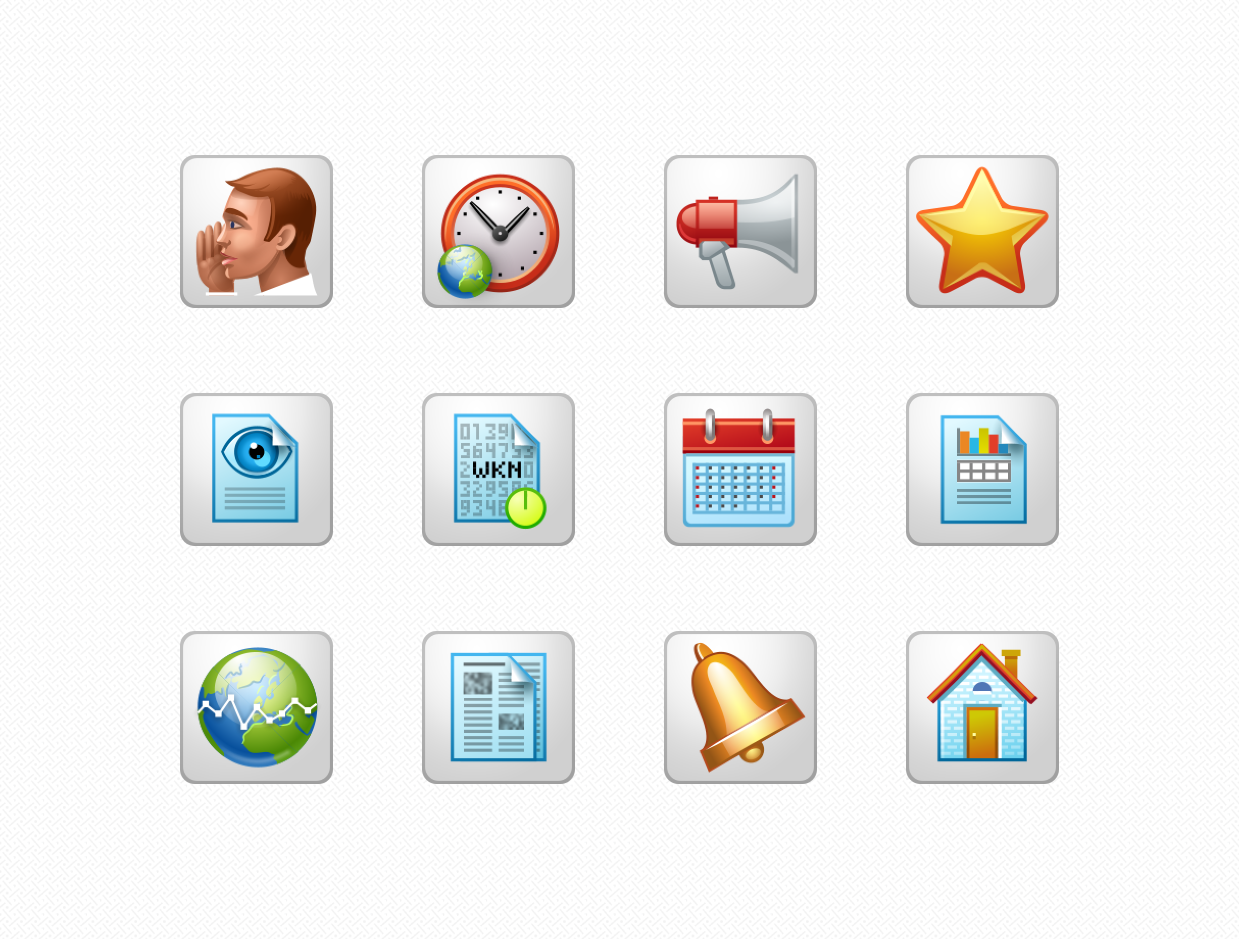
Solution
I developed a collection of icons and interface elements tailored to the bank’s digital platforms. For this project:
- Style: I adopted a realistic and glossy skeuomorphic style, which was highly popular at the time. The use of bright colors and intricate detailing ensured the icons were both visually striking and aligned with the bank’s desired aesthetic.
- Sizes: To accommodate the varying requirements of digital interfaces, I designed icons in small sizes such as 32×32, 24×24, and 16×16 pixels. Each icon was manually adjusted for pixel-perfect clarity and visual consistency across all sizes.


Impact
The icons contributed to a more engaging and intuitive user experience for BNP Paribas’ digital platforms. Their colorful, realistic style aligned with the bank’s brand messaging, while their functionality enhanced user satisfaction. The attention to detail in ensuring visual consistency and usability across all sizes played a critical role in elevating the overall user experience.