I designed two icon families for Mapzen’s mapping tools, giving the platform different visual treatments for points of interest and other map features.
Design problem
The library covered a wide range of locations. Each symbol needed to communicate its subject at a small size, while the collection had to remain consistent across two distinct styles.
My approach
I developed a minimal monochrome set and a more detailed color set. In both, I balanced recognizable features with the level of simplification needed for map use. The two treatments gave developers options for different interface styles.


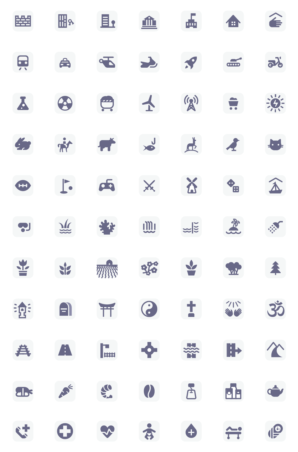
Delivered
Two coordinated icon libraries for Mapzen’s open-source mapping platform. The project brought together category coverage, small-scale clarity and visual consistency across a large family of assets.
