Project
Airbnb Infosec: Visual Identity and Annual Security Campaigns
Overview
Airbnb’s internal security team partnered with me on multiple visual initiatives: from developing a logo and icon system for their team identity to producing large-scale illustration campaigns for their annual Hackerville event.
Role
Creative Lead
- Team identity design
- Yearly Hackerville campaign art
- Visual storytelling
- Collaboration with Airbnb’s internal comms and security leads
Visual Identity
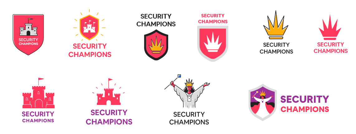
Airbnb’s Information Security Department needed a distinct visual identity for its internal Security Champions program. The goal was to create a branding system, including a logo and visual assets, that would communicate the strategic importance of the initiative while avoiding clichéd security imagery such as locks or shields, and could flex across docs, slides, merch, and internal tools, while also being easy to deploy without a design team involved.
Approach
To establish clarity and hierarchy within the program, I proposed a visual metaphor rooted in chess — a game universally associated with intelligence, analysis, and structured progression. This approach not only reflected the analytical mindset of security experts, but also aligned well with Airbnb’s preference for abstract representations over traditional symbols.
Concept Development
I explored two key directions:
- Chessboard Coat of Arms: A heraldic composition featuring a chessboard and pieces to convey structure, logic, and strategic depth.
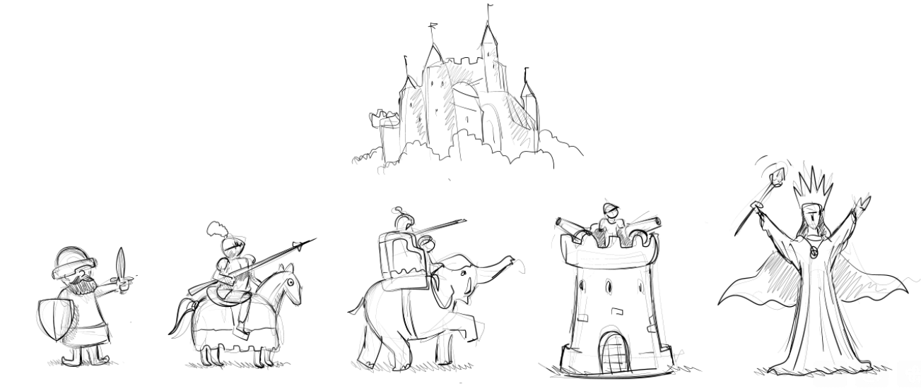
- Castle & Guards: A stylized fortress guarded by chess pieces representing each level of the program. The design incorporated historical references, such as the bishop piece originally represented by an elephant in medieval chess.
The second concept was selected for further development due to its clarity, narrative strength, and scalability.
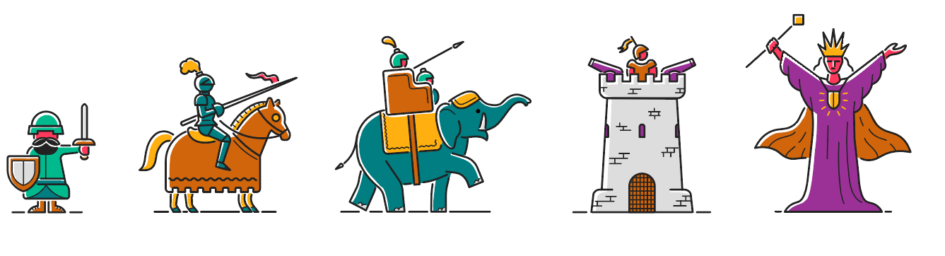
Visual System
Building on the approved concept, I created a series of illustrations and levels-based visuals that represent each stage of the Security Champions program. I explored multiple color modes to align with Airbnb’s brand palette, ultimately landing on a lighter version favored by the client for its vibrancy and clarity.
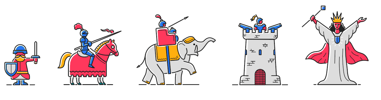
To complement the visual levels, I designed a standalone logo that could unify the program while representing the top tier: the mage. Symbolically tied to the queen — the most powerful chess piece — this character conveys mastery, foresight, and leadership within the organization.
Hackervile Visual Campaigns
Hackerville is Airbnb’s internal campaign series focused on digital security awareness. Each year, I was tasked with designing the central visual that would shape the campaign’s identity across posters, swag, slides, and screens.
The challenge: make complex and often dry security topics approachable and engaging for a company-wide audience. Each illustration used metaphor and world-building to give abstract threats a more tangible, memorable form.
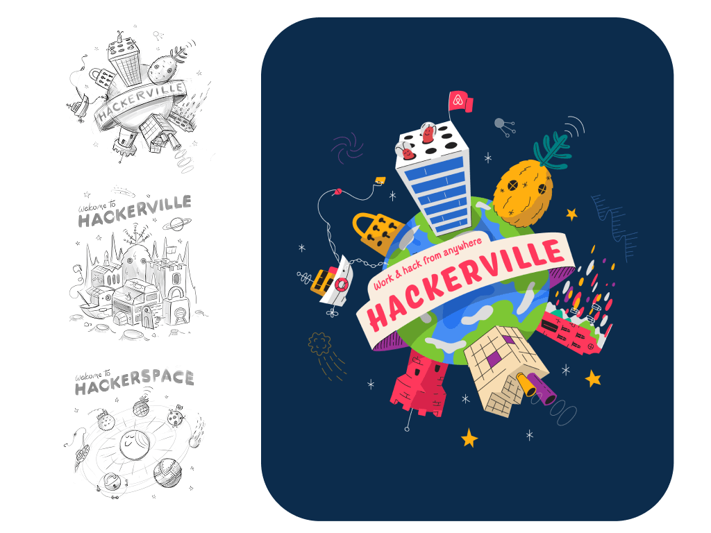
Remote Edition
This campaign featured a metaphor of a Hackerville located in deep space, emphasizing the availability of remote connections, and possibility to work from everywhere.
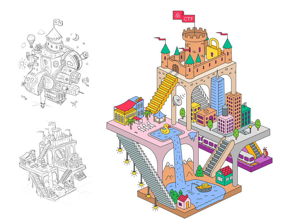
Escher City Edition
A surreal city, reflecting the complex, multilayered, evolving nature of digital infrastructure and access.
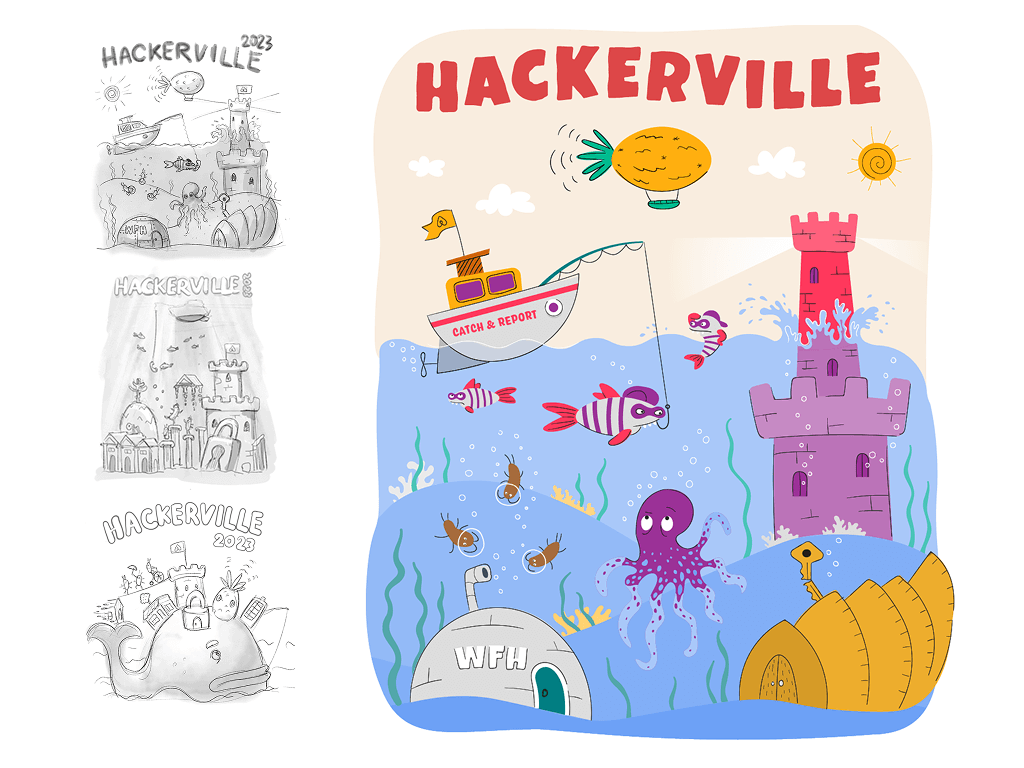
Underwater Edition
A underwater world filled with phishing boats, data octopuses, and hidden fortresses, visualizing unseen threats and the need for awareness.
AI Edition
A bold split-view illustration exploring the surface polish of AI and its underlying abstract infrastructure below.
The Hackerville art became a beloved internal signature, shared across onboarding, swag, team slides, and annual reports. Over the years, it helped make security feel more approachable, creative, and human.
This project blurred the line between illustration and product storytelling, transforming mandatory awareness into something people actually engaged with.
Credits
- Denis Sazhin — visual design, concept, and illustration
- Arseni Harkunou | StillHuman — design direction